
How to Create Advanced Interactive KPI Tiles in Odoo Dashboards
Muhammad Haroon
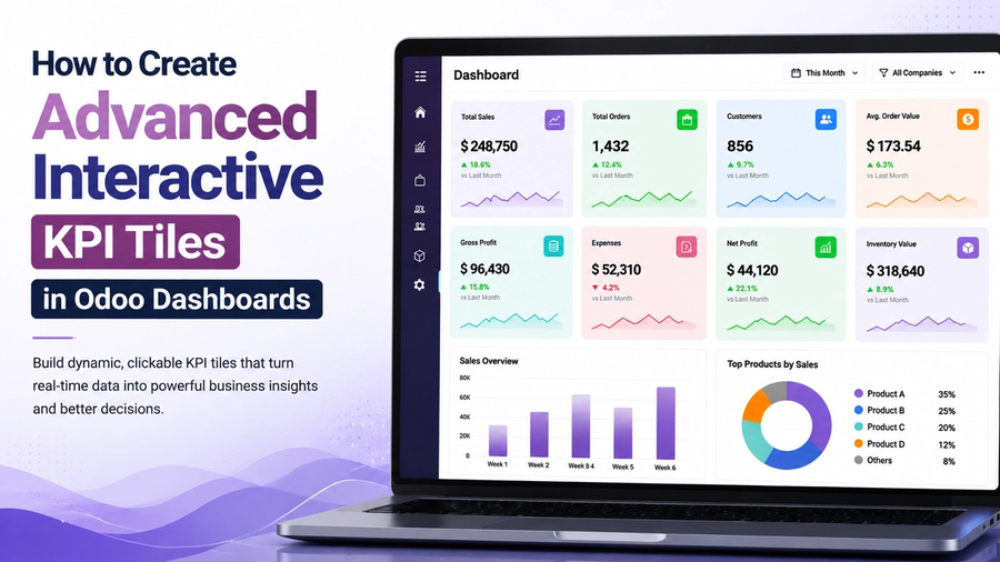
A KPI tile looks very simple on a dashboard. It shows a number and sometimes an arrow that tells you if the value is going up or down. But a well-designed KPI tile is one of the most useful reporting tools in Odoo. It helps managers and business owners to see the most important business information in detail instead of opening multiple reports or menus.
Odoo's built-in reports can display data but they don't easily create interactive and real-time KPI tiles that connect directly to your Odoo records. That’s why Odoo Dashboards bring a solution for you and help you build KPI tiles that update automatically and allow users to click through to the related records. So you must want to know how to set up Odoo Dashboards, create the data behind a KPI tile, and add useful features to create a powerful business dashboard. Let’s discuss it all.
What are KPI tiles in Odoo?
KPI tiles are small dashboard cards that show one important business metric, such as total sales, pending orders, or unpaid invoices. They can also compare the current value with a previous period to show whether performance has improved or declined. In Odoo Dashboards, KPI tiles update automatically and help users click to view the related records, and can be customized with currency symbols, shortened numbers, and color indicators to highlight good or bad performance.
What Makes a KPI Tile Advanced and Interactive?
A basic KPI tile shows a static figure. But an advanced and interactive KPI tile in Odoo Dashboards typically does much more. It gives users useful information and lets them interact with the data.
An advanced KPI tile can:
- Show one key metric along with a comparison such as this month vs. last month or the same month last year.
- Let users click the tile to open the related Odoo records with the correct filters already applied.
- Allow users to perform actions, such as approving, confirming, or validating records, directly from the tile.
- Update automatically at set intervals so users always see the latest data.
- Change based on filters applied to the dashboard such as date ranges, departments, or sales teams.
- Display calculated values like profit margins, percentages, or running totals instead of just raw data.
- Use colours or labels to highlight good, average, or poor performance.
- Hide or restrict sensitive data based on user roles and permissions.
- Work smoothly on both desktop and mobile devices, including drill-downs and filters.
How do you create a KPI dashboard in Odoo?
To create a KPI dashboard in Odoo, first build a dataset by connecting to an Odoo model, selecting the fields you need, and applying any filters or grouping. Next, drag a KPI tile onto the dashboard and connect it to a field or a calculated value from the dataset. You can then add comparison metrics, enable drill-downs to related records, and apply global filters. All of this can be done using the visual builder, without writing any code.
Step 1: Set Up Odoo Dashboards on Your Instance
First of all, you have to install and set up Odoo Dashboards on your Odoo system before creating KPI tiles.
- Start your free trial. Visit odoodashboards.com and click on Start your 14-day free trial. You only need a valid email address and no credit card is required.
- Get your API key and GitHub access. After your trial starts, open the Billing and Benefits section. Copy your API key and connect your GitHub account to access the module code.
- Download the correct version. The repository includes versions for Odoo 15 to Odoo 19. Download or clone the branch that matches your Odoo version and install it on your Odoo server. If needed, your developer can handle this step.
- Enable Developer Mode and set user permissions. In Odoo, go to settings and enable Developer Mode. Then open Groups, search for the SAS access groups and give dashboard access to the required users. Refresh your browser after making the changes.
- Activate your API key. Open the API Key Activation page in Odoo, paste your API key, give it a name, and save it.
After completing these steps, you're ready to create datasets, dashboards, and KPI tiles. This setup only needs to be done once for each Odoo instance. After that, you can focus on building your dashboards.
Step 2: Build the Dataset Behind Your KPI Tile
Every KPI tile gets its data from a dataset. The dataset decides what information appears on the dashboard and how it is displayed. Most of the advanced features of a KPI tile are set up here.
- Choose only the fields you need. For example, a Sales Order model has more than 60 fields but a revenue KPI usually only needs a few such as the order date, total amount, status, and salesperson. Using only the required fields makes the dashboard faster and easier to manage.
- Filter and group the data. Instead of showing every record, you can display only the information that matters. For example, show confirmed sales orders for the current month and group them by salesperson. This makes the KPI more useful and meaningful.
- Preview your data. Before creating the KPI tile, you can view a sample of the records to make sure the dataset is correct.
- Combine data from different modules. If a KPI needs information from multiple sources, you can merge them into one dataset. For example, combine Sales Orders and POS Orders to show total revenue across all sales channels.
- Use the same dataset in multiple dashboards. A single dataset can power a KPI tile, a chart, or a table on different dashboards. If you update the dataset once, all connected dashboard components are updated automatically.
For more advanced requirements, Odoo Dashboards also include a SQL Editor. This helps you create custom queries when the visual dataset builder isn't enough. But for most KPI tiles, the visual builder provides everything you need.
Step 3: Place the KPI Tile and Add a Comparison Metric
Once your dataset is ready, drag a KPI tile onto the dashboard. At first, it will simply display a single number. But the thing that makes a KPI tile truly useful is the comparison feature.
A good KPI tile not only shows the current value but also compares it with an earlier period, such as this month vs. last month or this quarter vs. the same quarter last year. It usually displays a large number with a small percentage change below it. A green indicator shows improvement while a red indicator shows a decline. This helps users understand business performance in detail.
Before adding the tile to your dashboard, preview it using live data. Check that the number, comparison, formatting, and grouping are correct. Once everything looks right, place the tile on the dashboard.
Step 4: Make the Tile Clickable
This feature turns a simple KPI tile into an interactive business tool. Instead of only showing a number, the Tile lets users open the related data in Odoo with a single click.
- Direct drill-down: For example, if a "This Month Sales" KPI shows the total sales, clicking the tile opens the Sales Orders that make up that total. The records are already filtered, so there's no need to search or apply filters manually.
- Deep drill-down: A KPI tile can also take users directly to related records. For example, instead of opening the Sales Order list first, a sales KPI can open the list of customers who placed those orders.
This makes it much easier to understand the data behind a KPI. Users don't have to search through different menus, they simply click the tile and immediately see the information they need.
Step 5: Let the KPI Tile Perform Actions
Advanced KPI tiles not just show data but they also let users take action without leaving the dashboard.
For example, a KPI tile or a related table can trigger Odoo server actions such as Approve, Confirm, Validate, or other custom actions. If you have a Pending Sales Orders tile, users can select the orders and click Validate to confirm them directly from the dashboard without opening the Sales app.
You can also embed dashboards or individual KPI tiles inside Odoo form views. For example, when you open a customer record, you can display a dashboard that is already filtered for that customer. This gives users the information they need in one place without using smart buttons or custom development.
Step 6: Layer In Computations
Raw data is often not enough to create a useful KPI. Computed fields help you to turn basic numbers into meaningful business metrics.
- Perform calculations: You can calculate new values using existing fields. For example, multiply the unit price by the quantity to calculate the total line value.
- Calculate percentages: Create metrics such as profit margin, growth rate, or goal achievement by using percentage formulas. For example, divide profit by revenue to calculate the profit margin.
- Use aggregations: Display totals, averages, counts, unique counts, minimum values, or maximum values. For example, you can show the total sales amount for each salesperson without doing any manual calculations.
- Convert values into labels: Instead of showing only numbers, you can create easy-to-read labels. For example, classify orders as High Value, Standard, or Small based on their total amount.
These computed fields make KPI tiles more useful by displaying meaningful business metrics, such as Profit Margin (%) or Days Overdue, instead of just showing raw data from the database.
Step 7: Add Conditional Formatting and Row Tagging
A number tells you what happened but conditional formatting helps you understand whether the result is good or bad.
With conditional formatting, KPI tiles and tables can automatically use colours or labels based on the data. For example, invoices can be marked as Overdue, At Risk, or On Track based on their due dates. This helps you to easily find important records as soon as the dashboard opens.
For finance and operations dashboards, this feature is especially useful. Instead of just showing numbers, the dashboard highlights items that need attention and helps users make faster and better decisions.
Step 8: Wire Up Filtering So the Tile Responds Live
Interactivity is not just about clicking a KPI tile. It also means the tile updates automatically based on the filters applied to the dashboard.
- Filter by any field: Every field in the dataset can be used as a filter without any extra setup.
- Static filters: You can lock a tile to show only specific data such as Status = Confirmed, no matter what other filters are applied.
- Interactive filters: Add filters directly to a tile or table so users can easily choose values from a list instead of typing them.
- Global dashboard filters: Apply one filter such as Region = North and every KPI, chart, and table on the dashboard updates automatically.
- Context-aware filters: Filters work together. For example, after selecting a product category, the product filter only shows products from that category.
- Default date filters: Quickly view data for common time periods like Today, This Month, Last Quarter, or This Year.
- Advanced filter options: Create more accurate results using conditions such as greater than, less than, between, contains, and AND/OR logic.
For example, a revenue KPI tile can update automatically when a user changes both the Region filter and the Date filter. This makes the dashboard much more useful than a tile that always shows the same fixed number.
Why Performance Matters
A dashboard is only useful if it loads quickly. Large datasets can slow down reports, especially when they use Odoo's standard reporting system. Odoo Dashboards for beginners improves performance by using direct SQL queries instead of relying only on Odoo's ORM. This allows reports to load much faster, even when working with large amounts of data.
For reports that don't need real-time updates such as year-to-date sales or last month's performance, Odoo Dashboards can also cache the data. The cache can refresh automatically every hour, day, or week, so dashboards stay fast while still showing accurate and up-to-date information.
Odoo Dashboards for Real-Time Business Reporting
If you want to turn your Odoo data into clear, interactive dashboards, Odoo Dashboards makes it easy. Create dashboards with drag-and-drop KPI tiles, live drill-downs, and real-time filters. Get all these features inside your own Odoo system with no coding required. Start your 14-day free trial today with no credit card required, and build your first interactive dashboard in just a few minutes.
FAQs
Can Odoo dashboards be customized?
Yes. You can customize the layout, colors, charts, number formats, and displayed metrics. You can also share different dashboard views with different user roles, such as executives, managers, and sales teams.
How do interactive dashboards improve reporting?
Interactive dashboards let users click a KPI to view the related records, apply filters instantly, and even perform actions like approving or validating records without leaving the dashboard.
Which Odoo modules support KPI dashboards?
Odoo Dashboards works with any Odoo model, including Sales, Accounting, Inventory, Purchase, POS, and CRM. You can also combine data from multiple modules into a single dashboard.
What are the best KPIs to display in Odoo?
Useful KPIs include monthly revenue, pending approvals, overdue invoices, active customers, order counts, and profit margin. Choose KPIs that help users make quick business decisions.
How do you create clickable KPI cards in Odoo?
Enable the drill-down option on the KPI tile. When users click the tile, they can open the related records or jump directly to linked data, such as customers behind a sales report.
What is the best dashboard module for Odoo?
The best choice depends on your needs. Odoo Dashboards is a strong option because it supports interactive dashboards, drill-downs, Odoo actions, embedded dashboards, and fast performance using direct SQL queries.
See Odoo Dashboards in action
Start a free 7-day trial and build your first dashboard in minutes — or book a walkthrough and we'll show you how your team would use it.