
Data Visualization in Odoo: Best Practices
Muhammad Haroon
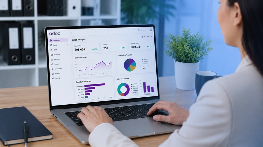
Odoo stores a massive amount of operational data from different departments, including sales orders, invoices, inventory movements, employee records, project tasks, and more. But the raw data you see in list views is not helpful, as you can’t make decisions based on it. Data visualization in Odoo converts that data into charts, dashboards, pivot tables, and KPIs that help your team spot trends, make faster decisions, and communicate performance clearly.
A well-designed dashboard helps managers identify problems early and discover new opportunities. But an attractive dashboard is not enough; a dashboard must answer questions and present the right information to the right people. Let’s show you the best practices for using Odoo's built-in visualization tools effectively.
What Is Data Visualization in Odoo?
Data visualization in Odoo refers to the use of built-in charts, pivot tables, kanban views, dashboards, and graph views to represent business data visually. It turns records from modules like Sales, Accounting, Inventory, HR, and CRM into actionable visual reports without writing code.
Within Odoo, every department generates valuable business data. Rather than displaying rows of numbers, Odoo presents information visually so users can immediately understand what's happening inside the company.
For example, a sales manager can quickly identify seasonal trends using a line chart rather than reading a spreadsheet with twelve months of sales data.
Understand Odoo's Built-In Visualization Tools
Understand what Odoo offers you before implementing best practices:
- Graph View: bar, line, and pie charts on any list model
- Pivot View: drag-and-drop multi-dimensional tables for aggregated analysis
- Kanban View: card-based pipeline visualization for workflows
- Activity View: timeline-style display for scheduling and tasks
- Dashboard (Reporting module): pre-built and customizable KPI tiles
- Cohort Analysis: period-over-period retention and trend tracking
Each of these is accessible directly from the view switcher in most Odoo modules. The graph and pivot views are the most flexible for ad-hoc analysis.
Match the Right Visual to Your Data
Choosing the wrong chart type is one of the most common data visualization mistakes. Use the right visual for each use case:
- Bar Charts are best used when you want to compare values across categories, such as analyzing sales by product or region.
- Line Charts help you track trends over time and are ideal for monitoring revenue growth and monthly targets.
- Pie or Donut Charts are useful for showing proportional shares, such as an expense breakdown by department.
- Kanban Views provide visibility into the pipeline and workflow status. It is commonly used for CRM leads and project tasks.
- Pivot Tables support multi-dimensional data analysis. It enables users to examine inventory by warehouse and category.
- Activity and Gantt Views are designed for project timelines and scheduling, such as managing manufacturing orders and HR leaves.
- KPI Tiles offer single-metric snapshots. It helps users quickly track open invoices or active subscriptions.
- Cohort Analysis is used for retention and period comparisons. It is valuable for tracking subscription churn.
Best Practices for Odoo Data Visualization
Use Filters and Group-By Intentionally
Odoo's graph and pivot views rely on your active filters and group-by settings. Before building any visual:
- Select the right time period, such as this month, this quarter, or the fiscal year.
- Use relevant filters such as firm, warehouse, sales team, and product category.
- Use Group By to segment the data and never leave it flat unless comparing totals.
Limit Dimensions to What Matters
You can add unlimited row and column groups with the help of pivot tables in Odoo. But remember that more dimensions don't mean more insight. Try to stick to two dimensions maximum for readability. Adding a third dimension usually creates a table that requires scrolling and mental effort to understand.
Save Favorite Views for Repeated Reports
Odoo also helps you save filter and grouping combinations as Favorites. If your team checks the same sales summary or inventory status every week, then save it as a default or shared favorite. So you don't need to do this manual setup again and again. It also ensures consistency across users.
Use the Pivot View for Comparisons, Graph View for Trends
These two views serve different analytical purposes:
- Pivot View is best for comparing values across multiple categories simultaneously, like product sales by region and month.
- Graph View (especially line charts) is better for tracking how a metric evolves over time.
Mixing up these views leads to misinterpretation. A bar chart comparing 12 months of data is harder to read than a line chart showing the same trend.
Keep Dashboards Focused — One Goal Per Dashboard
A common mistake is building a single dashboard that tries to show everything like sales, HR, finance, inventory, and projects all at once. This overloads things and is difficult to understand for your audience and dilutes focus. Instead of creating one dashboard, create role-specific dashboards:
- Sales Manager Dashboard that shows the pipeline health, monthly revenue, and top reps
- Finance Dashboard that shows accounts receivable aging, cash flow, and expense ratio
- Operations Dashboard that shows inventory levels, order fulfillment rate, and production status
Align Visualization with Business KPIs, Not Just Available Data
Odoo gives you access to dozens of fields on every model. Visualizing everything makes things easy. Resist it. Start by identifying the 3–5 KPIs that directly affect a decision:
- What is the metric measuring?
- Who acts on this data?
- What decision does it inform?
If you can't answer these questions, the visual probably doesn't belong on the dashboard.
Common Dashboard Design Mistakes
Even experienced users make mistakes. Common issues include:
- Too many charts
- Tiny fonts
- Confusing colors
- Unnecessary animations
- Duplicate metrics
- Poor filtering
- Inconsistent layouts
- Overloaded dashboards
Avoiding these mistakes dramatically improves usability.
Ready to Transform Your Odoo Data Into Decisions?
If you really want to transform your business data, Odoo Dashboards is here for you. Odoo users who want advanced, real-time dashboards, KPI tracking, and multi-module reporting can easily configure their workflow with our Dashboard solutions. From dashboard implementation and customization to advanced reporting and business intelligence, we empower your team with the tools needed to improve efficiency, increase visibility, and make confident, data-driven decisions every day.
Visit Odoo Dashboards to explore our dashboard features, request a demo, and enjoy a 14- day free trial.
See Odoo Dashboards in action
Start a free 7-day trial and build your first dashboard in minutes — or book a walkthrough and we'll show you how your team would use it.