Bar, line and area charts
Four chart types share the same settings:
- Vertical Bar: compare categories or months side by side.
- Horizontal Bar: rankings with long names, such as the top 10 products.
- Line Chart: a trend over time.
- Area Chart: a trend over time, drawn as a smooth line with a light fill.
Every chart has a Dimension (what goes along the axis: months, products, salespeople) and a Measure (the number for each one: sales, units, orders).
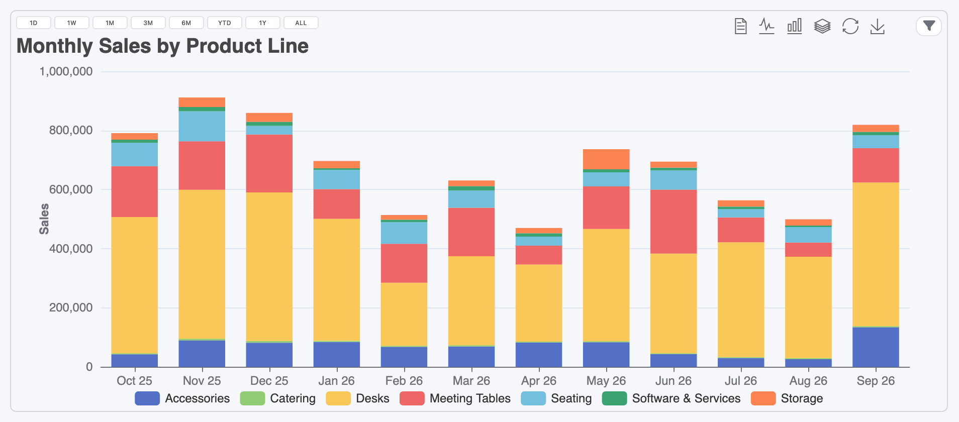
- Date range buttons (Show Default Date Range Buttons)
- Chart toolbar
- The widget's filters
Create a chart
Section titled “Create a chart”-
Click New Item, name it, and pick a chart type and a dataset on the General tab.
-
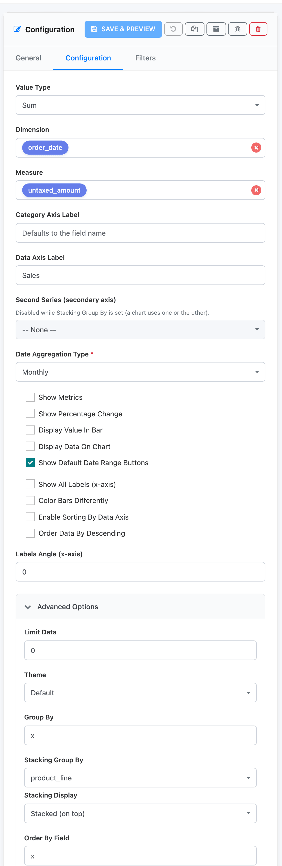
On the Configuration tab, choose the Value Type, usually Sum or Count.
-
Pick the Dimension. For a trend, pick a date field.
-
When the Dimension is a date, choose the Date Aggregation Type: Hourly, Daily, Weekly, Monthly, Yearly or Days Of Week.
-
Pick the Measure, the number to plot. It is hidden when the Value Type is Count.
-
Click Save & Preview.
Dates on the axis
Section titled “Dates on the axis”With a date dimension and a Date Aggregation Type, the axis shows one point per period, always in date order. Labels look like Sep 26 (monthly), 05-Jan (daily), WEEK 36 (weekly, ISO week numbers) and 2026 (yearly). Days Of Week adds up all Mondays, all Tuesdays and so on, from Sunday to Saturday.
To chart the last 12 full months, add two date filters on the widget: Is on or after the first day of the window and Is on or before the last. See Date filters.
Sorting and top N
Section titled “Sorting and top N”For a category dimension (products, customers, teams), the chart is sorted by value, smallest first. To show the biggest first and keep only some of them:
- Tick Order Data By Descending.
- Under Advanced Options, set Limit Data to the number of categories to keep, such as 10. 0 means no limit.
Advanced Options → Order By Field sorts by something other than the value: y (the default) is the measure, x is the dimension (alphabetical). Group By is x unless you need to group by several fields.
On a horizontal bar chart, the first category is drawn at the bottom. Top 10 Products gets the biggest product on top by ticking Enable Sorting By Data Axis, which also adds a sort button in the chart’s top-left corner. Viewers can click it to flip the order on their screen.
Labels
Section titled “Labels”- Category Axis Label and Data Axis Label name the axes, and the legend and tooltip use them too. Left empty, the axis has no title and the tooltip shows the field name.
- Display Data On Chart writes each value above its bar or point (to the right on horizontal bars), shortened to K, M and B.
- Display Value In Bar writes the value inside the bar (bar charts only).
- Show All Labels (x-axis) prints every category name instead of skipping some when they’re crowded. Combine it with Labels Angle (x-axis), such as 30, to tilt long names.
- Color Bars Differently gives each bar its own colour.
Percentage change
Section titled “Percentage change”Show Percentage Change labels every point with its change on the point before, such as +12.3% or -25.8%. The tooltip and the data view show the percentages too. It works on single-series charts only: stacked charts and charts with a second series ignore it.
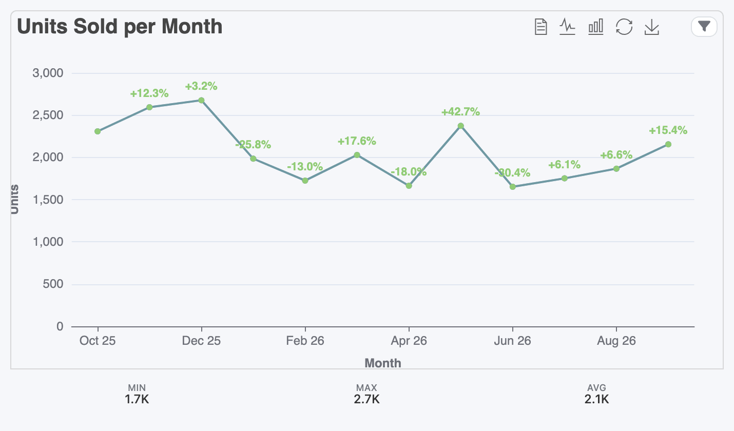
Show Metrics adds MIN, MAX and AVG of the plotted values under the chart, as on this one.
Stacking
Section titled “Stacking”To split each bar by a second field, for example monthly sales by product line, open Advanced Options and pick that field as Stacking Group By. Each value of the field becomes its own colour, with a legend.
Stacking Display decides how the parts are drawn:
- Auto (bars stack, lines separate): bars stack on top of each other; lines and areas are drawn side by side, since a stacked line is easy to misread as one big total.
- Stacked (on top): always stack.
- Separate: bars next to each other, or overlapping lines.
A second series
Section titled “A second series”Second Series (secondary axis) draws a second measure from the same dataset, with its own scale on the right. Use it when two numbers move together but differ in size, such as invoiced amounts (bars) and the part collected (line).
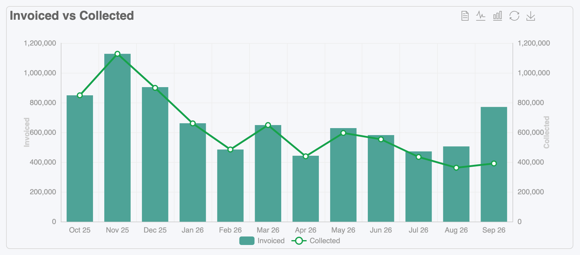
Pick the field, then its aggregation (Sum, Average, Min, Max or Count), how to draw it (Bar, Line or Area), a label and a colour.
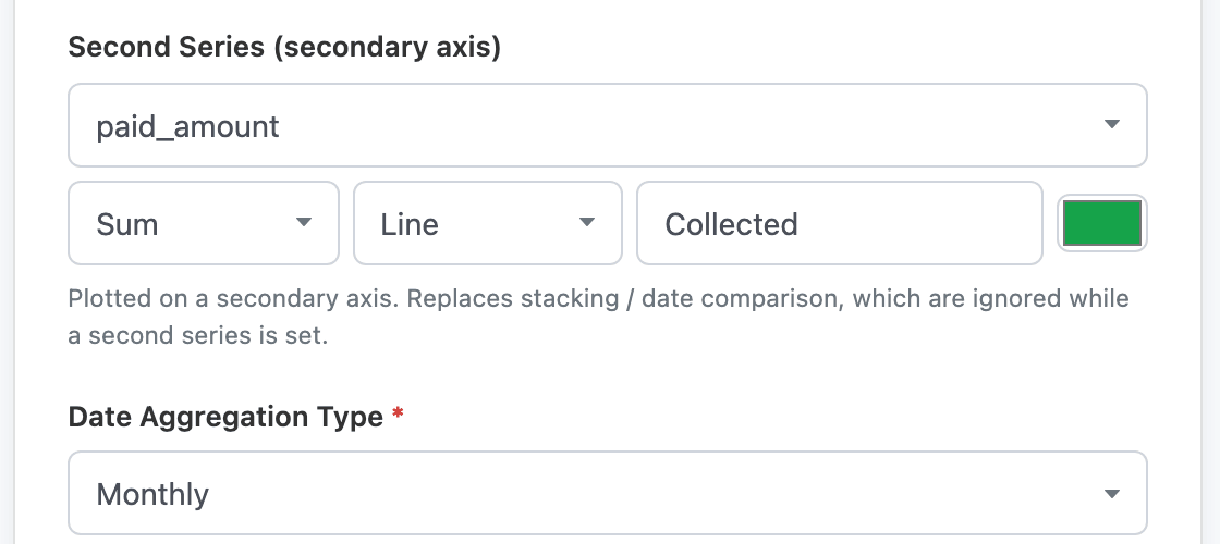
A chart has at most two series. While a second series is set, Stacking Group By is disabled, and the other way round.
Themes
Section titled “Themes”Advanced Options → Theme changes the colour palette: Default, Walden, Vintage, Macarons, Dark, Roma or Wonderland. Themes are set per chart, so pick one and use it on every chart of a dashboard.
The chart toolbar
Section titled “The chart toolbar”Hover over a chart to use its toolbar, top right. From left to right:
| Icon | What it does |
|---|---|
| Data View | Shows the numbers behind the chart as text you can copy. Close returns to the chart. |
| Switch to Line Chart / Switch to Bar Chart | Redraws the chart as lines or bars, on your screen only. |
| Stack | On stacked charts, switches between stacked and side-by-side. |
| Restore | Undoes the switches above. |
| Save as Image | Downloads the chart as a PNG. |
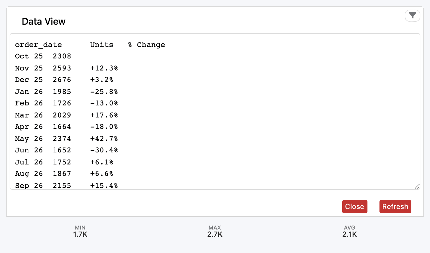
Changes made from the toolbar are never saved. Reload the page and the chart is back to how it was built.
Charts also have:
- the date range buttons 1D · 1W · 1M · 3M · 6M · YTD · 1Y · ALL, when Show Default Date Range Buttons is ticked. They set the range of the widget’s first date filter;
- the widget’s filters, top right (see Widget filters);
- ⓘ in the bottom-left corner on hover, with the info tooltip and an Update button that reloads this chart;
- the eye icon, bottom right, to blur it while you share your screen.
To open the records behind a bar or point, turn on Drilldown.