

Calendar heatmap
The heatmap is a calendar of one year: one small square per day, coloured by that day’s value. Darker squares are bigger days. It is good at showing rhythm: which weekdays sell most, when the quiet weeks fall, whether month-end is busier.

Set one up
Section titled “Set one up”-
Click New Item, choose Heatmap and a dataset.
-
On the Configuration tab, choose the Value Type.
-
Pick the Date Field. Only date fields are listed.
-
Pick the Measure, unless the Value Type is Count.
-
Click Save & Preview.
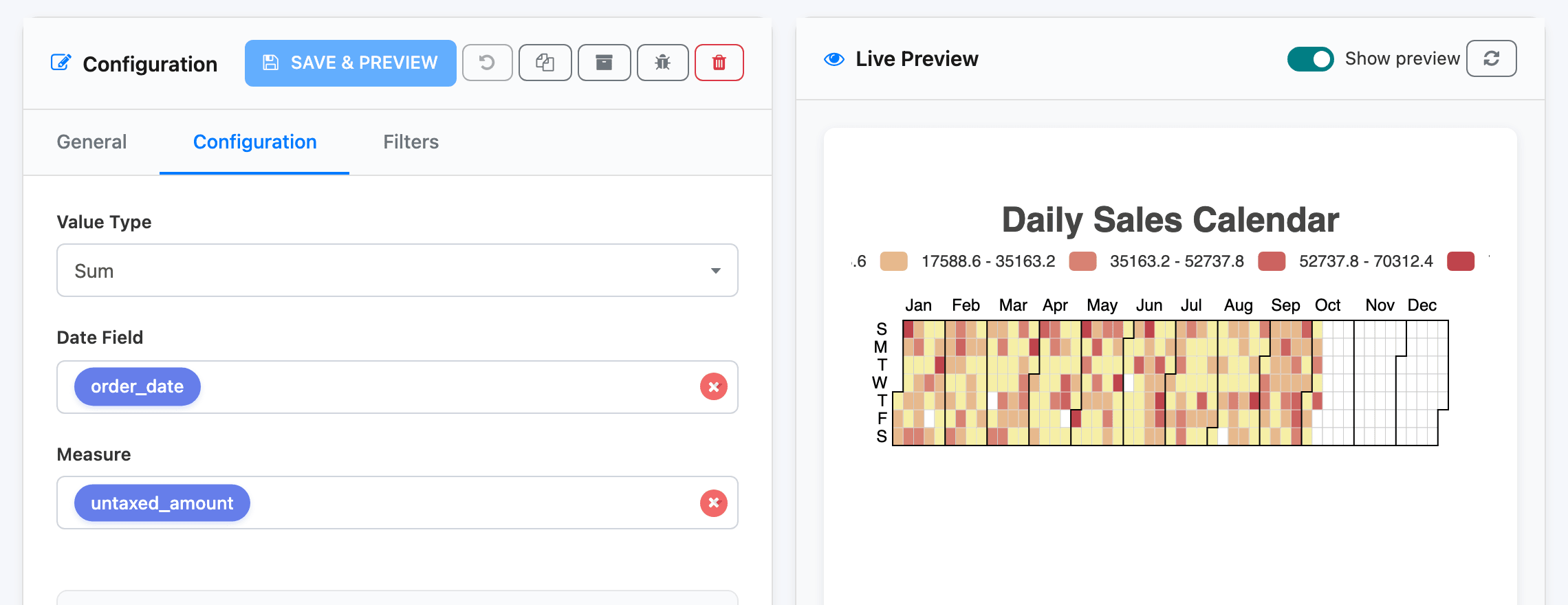
That’s all a heatmap needs. It has no axis labels, sorting or theme settings. Drilldown Options let viewers click a day to open its records (see Drilldown).
Which year is shown
Section titled “Which year is shown”The calendar covers one calendar year: the year of the earliest date in the data. If the widget’s data spans several years, only the first year is drawn.
So give every heatmap a date filter that keeps it inside one year. The Daily Sales Calendar on Sales Overview uses Year to date; viewers can pick another year with a filter on the widget or the dashboard’s date filter. See Date filters.
With no data at all, the heatmap shows an empty grid for the current year.
Reading it
Section titled “Reading it”- The legend above the calendar splits the values into five colour bands, from the smallest day to the largest.
- Hover a square to see the date and its value.
- Rows are days of the week, Sunday at the top. Black lines mark the months.