

Matrix Report
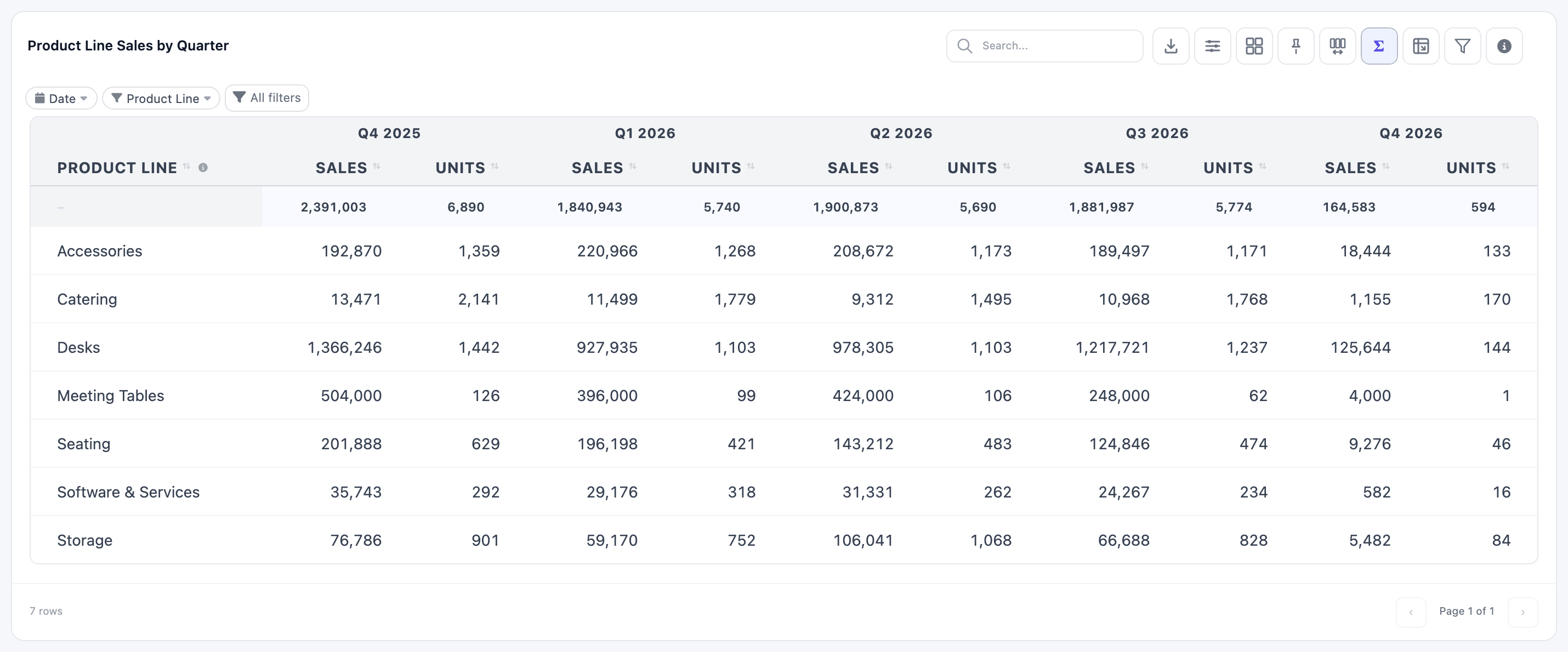
A Matrix Report turns the values of one field into columns: one column per month, per quarter, per warehouse or per sales team. Rows come from one or more other fields, and each cell holds one or more measures. Think sales by product line by quarter, or a profit and loss by account by month.
The calculation runs on the server, and the result is drawn as a table, so a matrix gets everything a table has: number formats, a totals row, conditional colours, search, export and pinned columns.
Set one up
Section titled “Set one up”-
Click New Item, choose Matrix Report and a dataset.
-
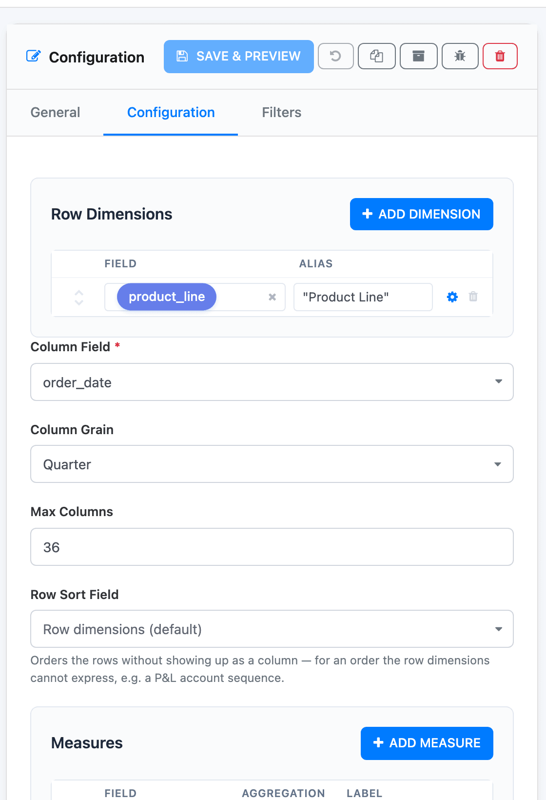
Under Row Dimensions, click Add First Dimension and pick the field for the rows, such as
product_line. Give it an Alias, the column header. Add more dimensions for nested rows, such as product line then product. -
Pick the Column Field: the field whose values become columns. For periods, pick a date.
-
Choose the Column Grain: Month, Quarter, Year, Week, Day, or Raw Value for a field that isn’t a date.
-
Under Measures, click Add First Measure. Pick the Field, the Aggregation and a Label. Add a second measure for two numbers per column, such as sales and units.
-
Click Save & Preview.
Columns
Section titled “Columns”With a date and a time grain, the matrix shows every period in the range, even empty ones, labelled Jan 2026, Q1 2026, 2026, W5 2026 or 05 Jan 2026. Set the range with a date filter on the widget; Product Line Sales by Quarter uses Last 365 days.
Max Columns (36 by default) caps the number of columns. When there are more periods, the oldest are dropped.
With Raw Value, there is one column per distinct value. When there are more values than Max Columns, the largest ones are kept (judged by the first measure). If every measure is a Sum or Count, the rest are added up into an Other column; otherwise they are left out. Empty values get a (none) column.
Measures
Section titled “Measures”Each measure row has:
- Field, with Custom… for calculated fields (see Custom fields);
- Aggregation: Sum, Average, Count, Count Distinct, Minimum or Maximum;
- Label: the sub-header under each column;
- a brush button, Display format, for decimals, currency, abbreviations, colours and conditional formatting (see Column formats);
- arrows to reorder, and a bin to remove.
With two or more measures, each period’s header spans one sub-column per measure, as in the screenshot.
Unlike tables, rows can’t hold a summarised expression such as SUM(...). Put those under Measures.
Row order and totals
Section titled “Row order and totals”Rows are sorted by the row dimensions. To sort by something that isn’t shown, such as an account code for a profit and loss, pick a Row Sort Field, and tick Sort Descending to reverse it.
Under Advanced, Show Totals adds a totals row (at the top of the table) with a total for each column. There is no grand-total column at the end of each row. Advanced also has the toolbar switches and Transpose table; see The table toolbar.
Changing the columns on the dashboard
Section titled “Changing the columns on the dashboard”Viewers can re-pivot a matrix without the builder. The Columns & Grain button in its toolbar opens a Column dimension menu with a Field and a Grain: switch from quarters to months, or from dates to sales teams.
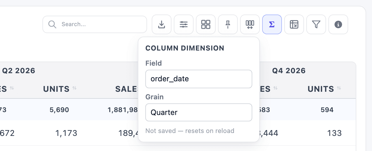
As the menu says, the change isn’t saved: it resets when the page reloads.