

Doughnut and funnel charts
Both charts split one total into categories.
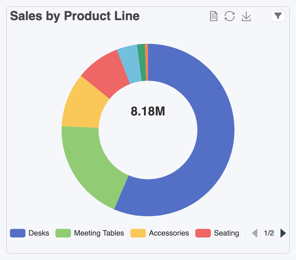
- A Doughnut shows each category’s share of the whole: sales by product line, invoices by payment status. The total sits in the middle.
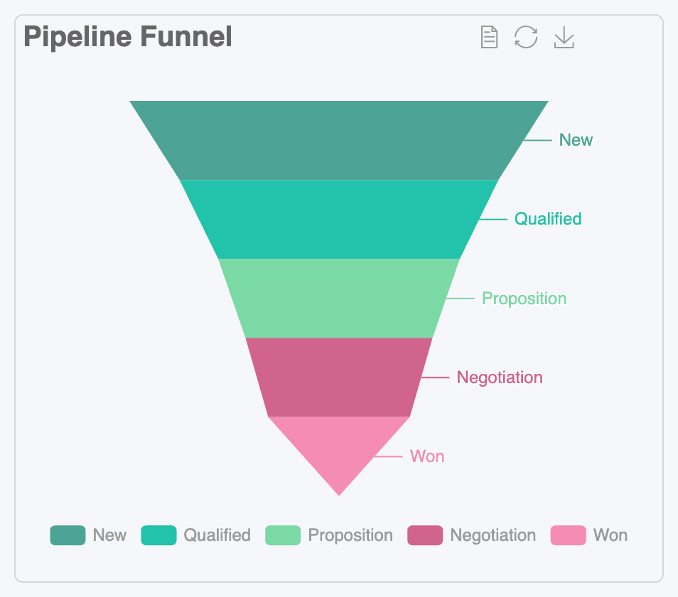
- A Funnel shows how many make it through each step of a process: opportunities by stage, quotations sent then confirmed then invoiced. The widest band is at the top.
Set one up
Section titled “Set one up”The settings are the same as for a bar chart, with fewer options:
- Value Type, Dimension (the categories) and Measure (the size of each slice or band).
- Show Metrics and Show Default Date Range Buttons.
- Under Advanced Options: Limit Data, Theme, Group By and Order By Field.
- Drilldown Options, to open the records behind a slice. See Drilldown.
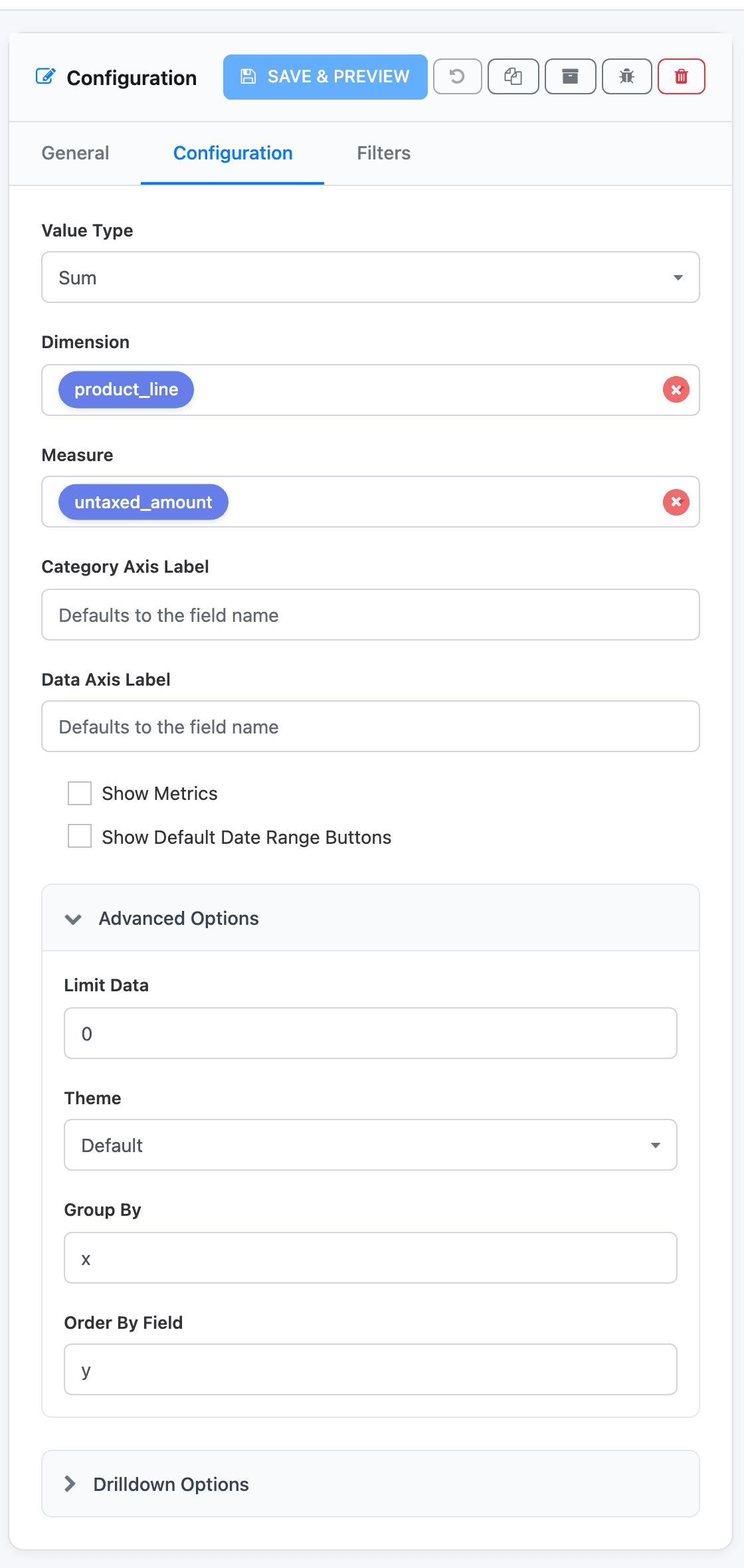
Doughnuts and funnels have no second series, stacking, percentage change or value labels. Category Axis Label and Data Axis Label are offered but have no visible effect.
Getting a good doughnut
Section titled “Getting a good doughnut”- Keep it to five or six slices. Doughnuts and funnels have no Order Data By Descending box, so categories come smallest first and Limit Data alone would keep the smallest ones. To keep the biggest, build the widget as a Vertical Bar first: tick Order Data By Descending, set Limit Data, then switch the type to Doughnut and save. The descending order is kept.
- When one category is most of the total, as Desks is here, a horizontal bar chart often reads better.
- The legend under the chart pages through the categories when they don’t fit; use the arrows.
Getting a good funnel
Section titled “Getting a good funnel”A funnel compares the size of each step, and the bands are sorted by size. So each row of the dataset should count towards every step it reached, not only the step it is at now. The CRM Pipeline dashboard’s funnel uses a dataset with one row per opportunity per stage reached: a won deal counts at New, Qualified, Proposition, Negotiation and Won. With Value Type Count, each band is then the number of opportunities that got that far.
If you plot only the current stage, the bands show where opportunities are sitting today, which is a different question and usually not funnel-shaped.
Hovering and clicking
Section titled “Hovering and clicking”Hover a slice or band to see its name and value.
The toolbar of both types has Data View, Restore and Save as Image. See The chart toolbar.