

Choosing a widget
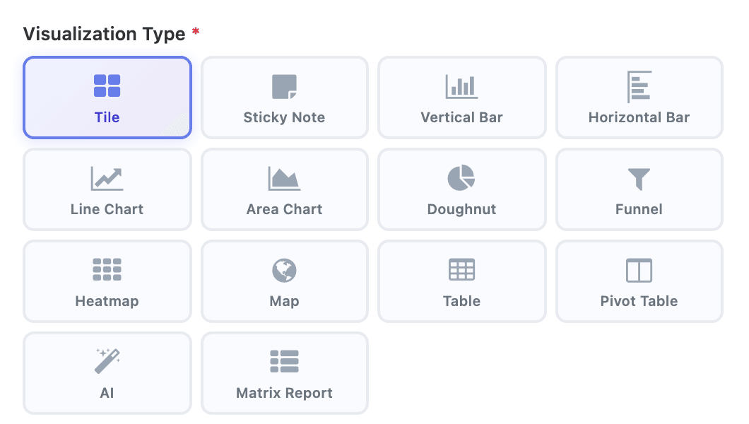
A widget answers one question about a dataset. The Visualization Type decides how it answers: as one big number, a trend over time, a ranking, a share of a whole, a calendar, a map or a grid of numbers. This page helps you pick the right one and explains the settings every type has in common.
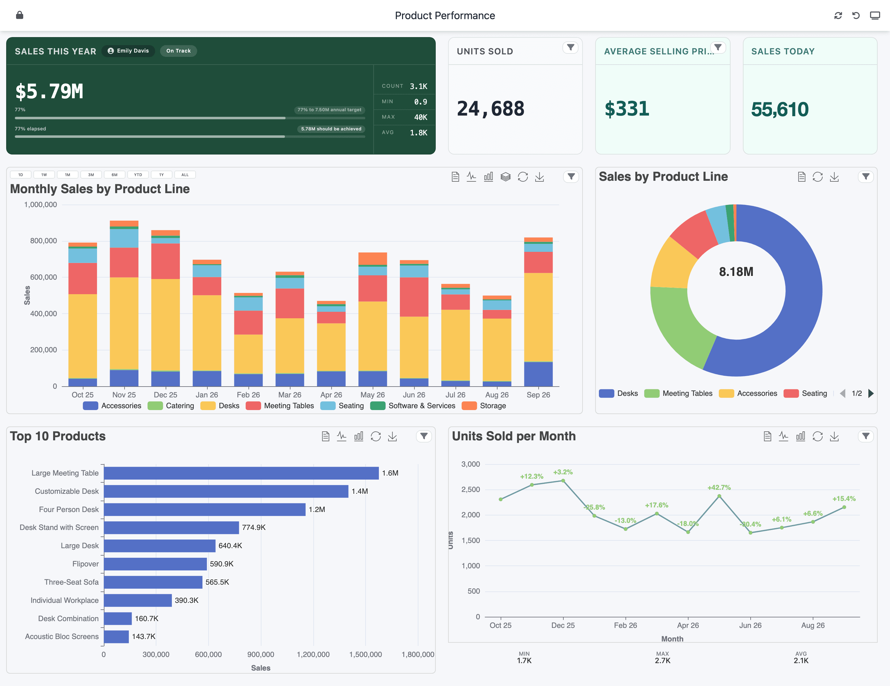
Which type answers which question
Section titled “Which type answers which question”| Question | Type | Notes |
|---|---|---|
| How much, in total, right now? | Tile | One number, with an optional goal bar, time bar and status. |
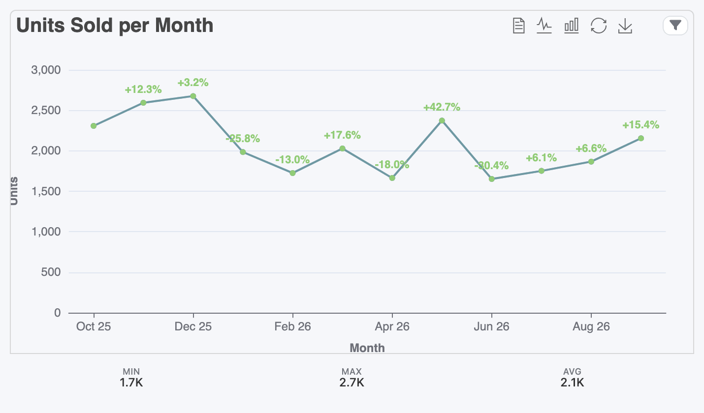
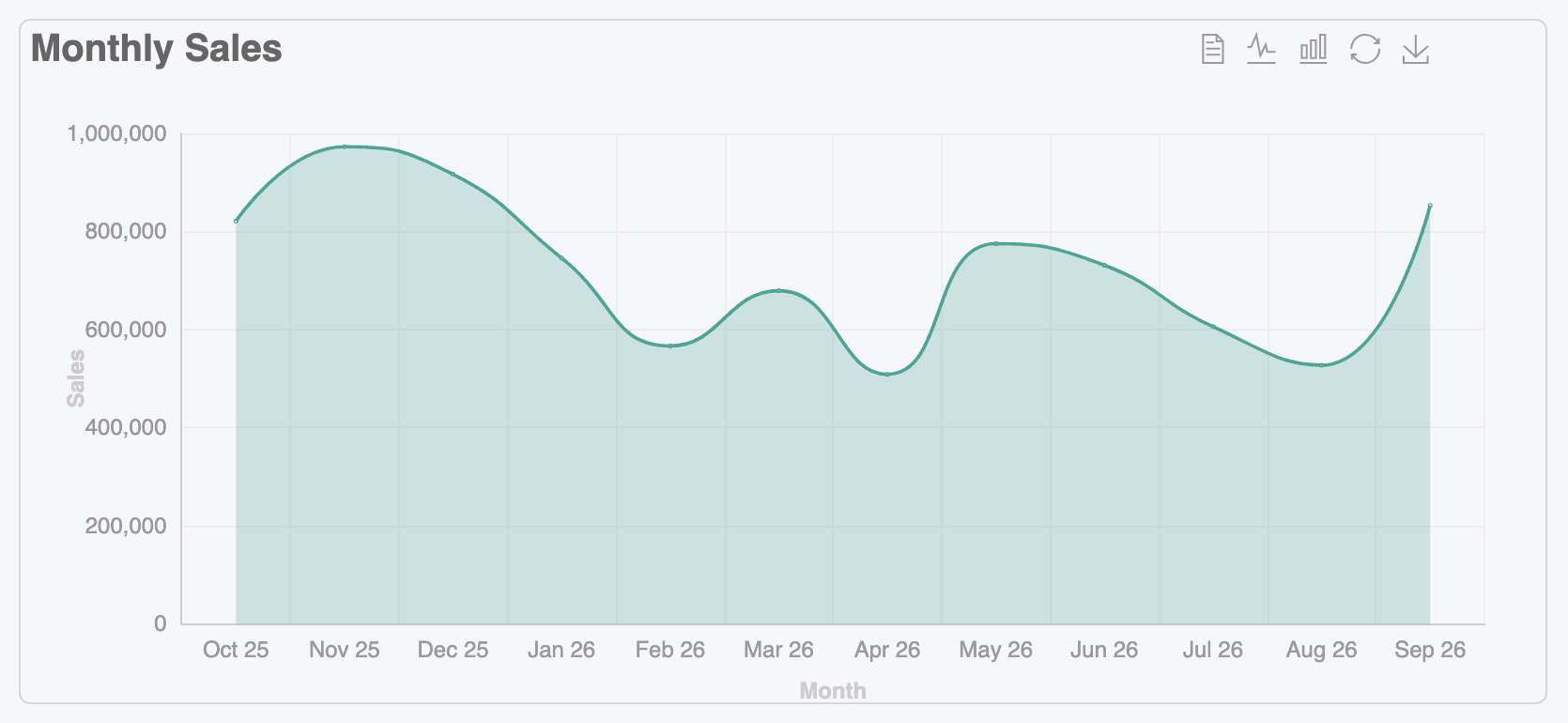
| How does it change over time? | Line Chart, Area Chart, Vertical Bar | Put a date on the axis and group it by day, week, month or year. |
| Who or what is biggest? | Horizontal Bar, Vertical Bar | Sort by value and keep the top 10. |
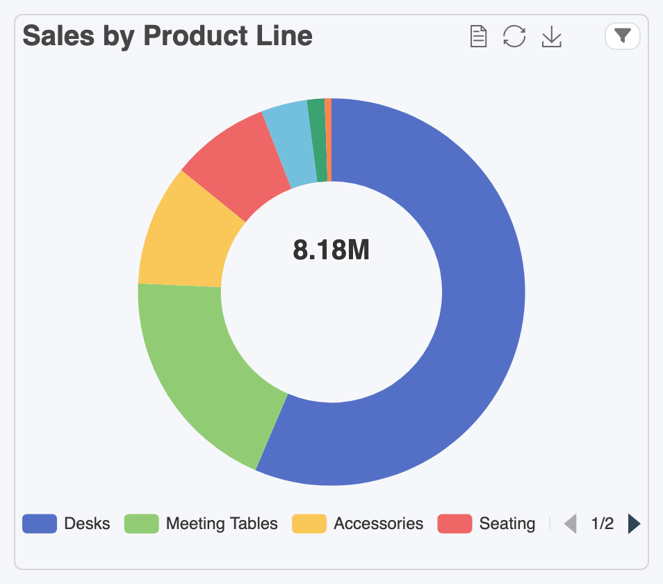
| What is each part’s share? | Doughnut | Best with a handful of categories. |
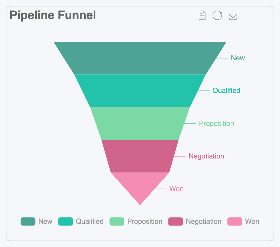
| How many make it through each step? | Funnel | Stages of a process, largest at the top. |
| Which days are busy? | Heatmap | A calendar of one year, one cell per day. |
| Where are my customers? | Map | Needs latitude and longitude in the dataset. |
| The detail, row by row | Table | Columns, totals, grouping and conditional colours. See Tables. |
| Rows by columns, such as product by month | Matrix Report | Calculated on the server, with one or more measures. |
| Free drag-and-drop exploration | Pivot Table | Older, browser-based pivot. Prefer the Matrix Report for new work. |
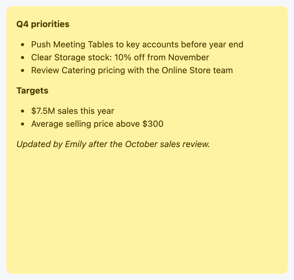
| A note to readers | Sticky Note | Text only, no data. |
Users with the AI Analytics (SAAS) right also see an AI card. It isn’t a type of its own: you describe what you want and it builds one of the types above. See One visualization with AI.
Gallery
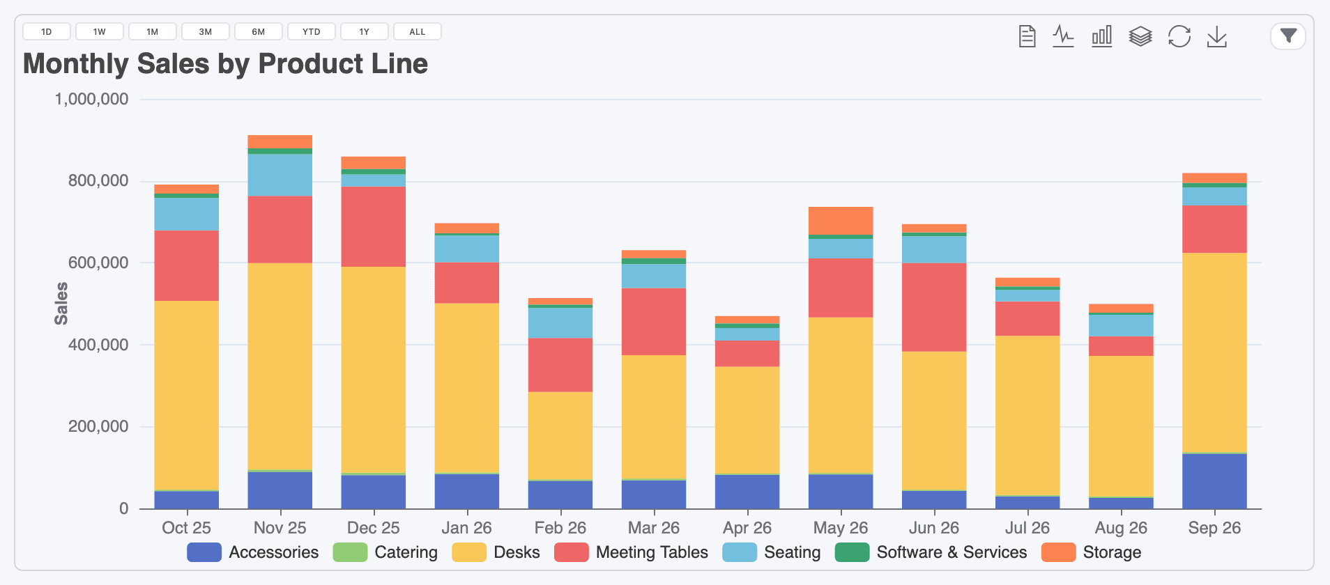
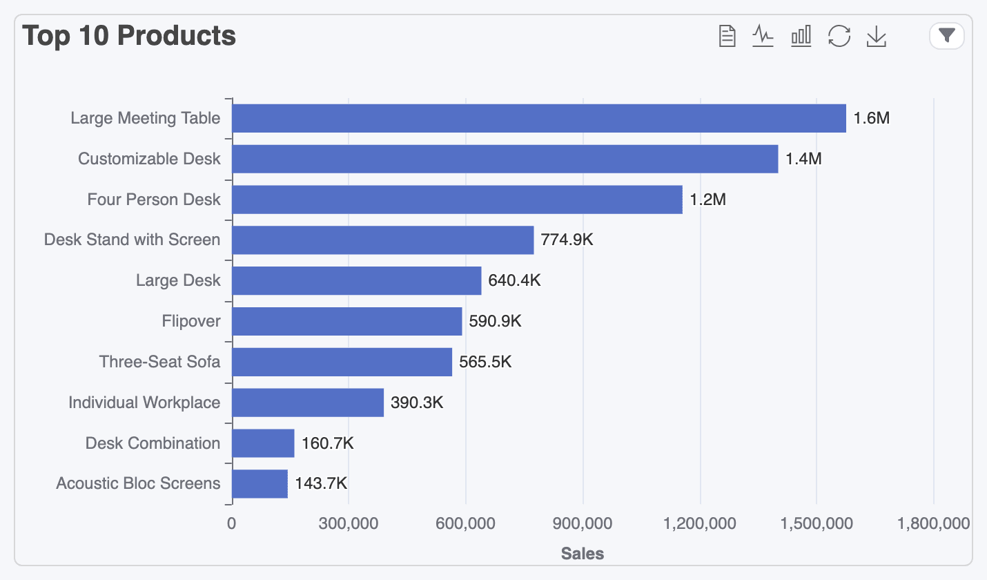
Section titled “Gallery”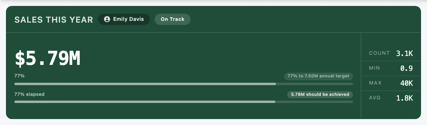

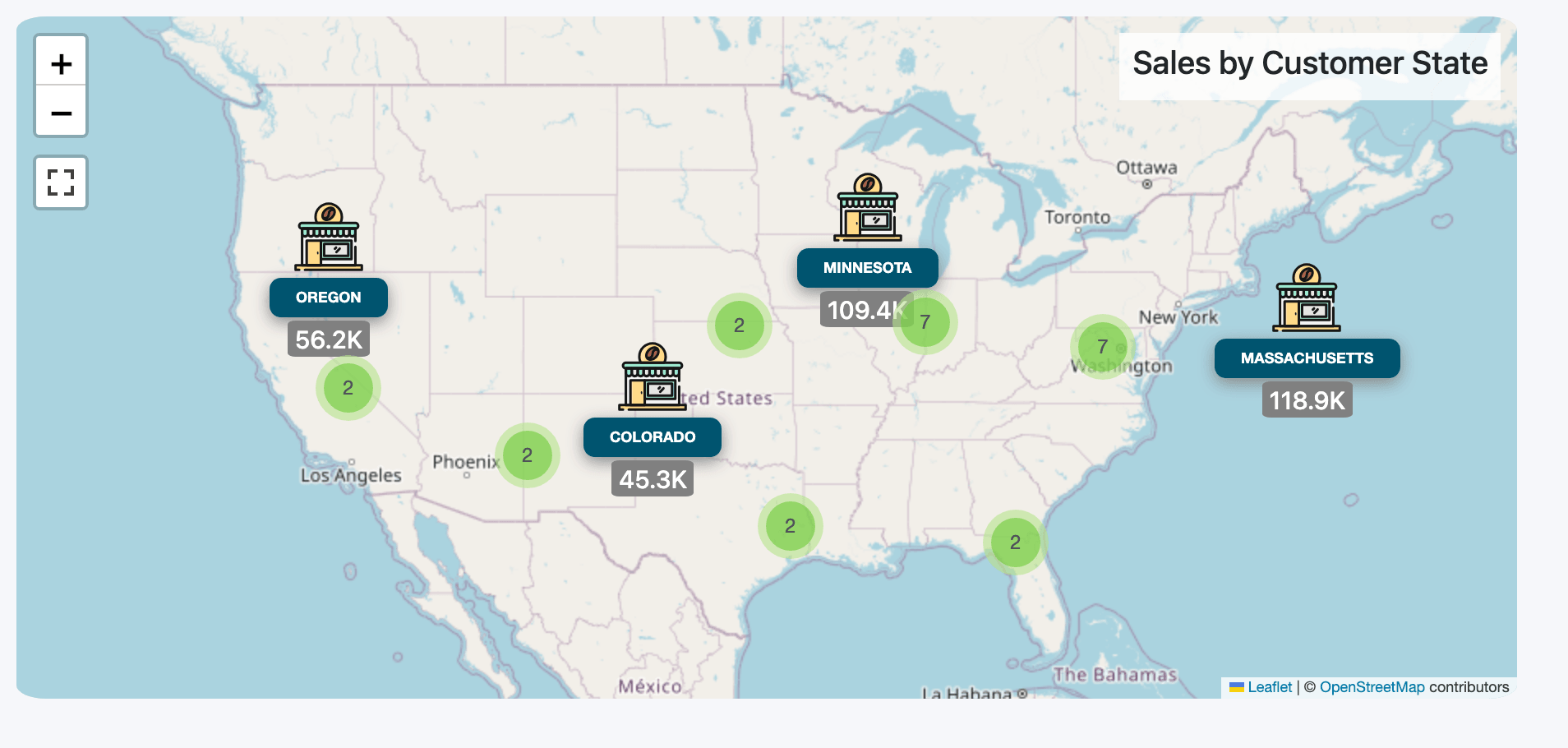
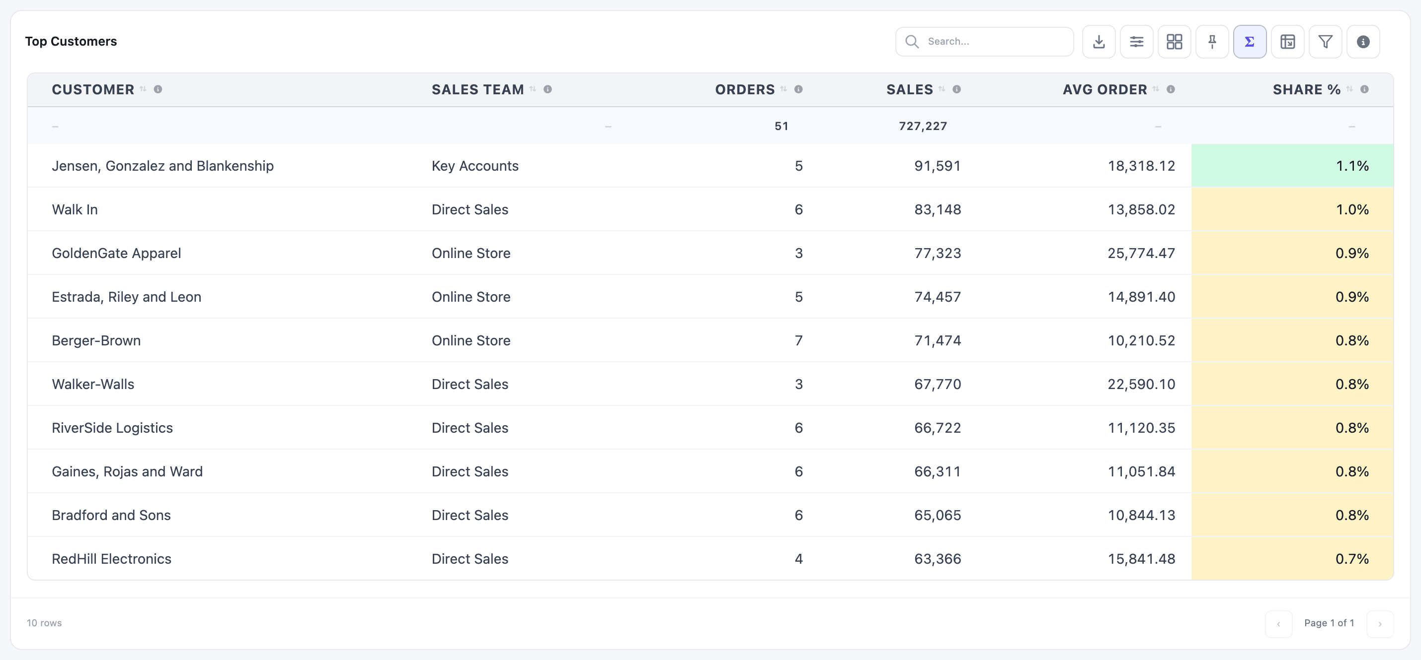
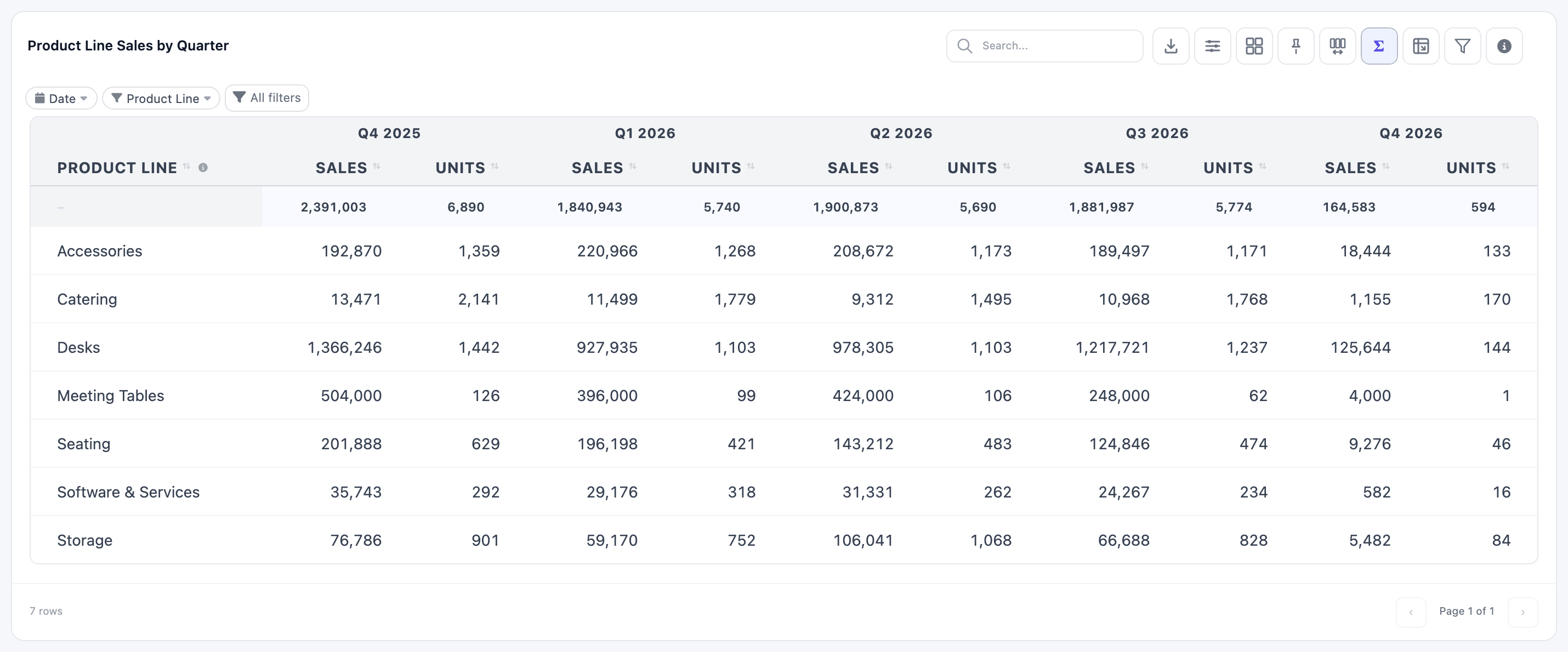
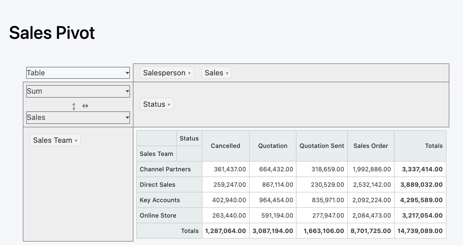
Changing the type
Section titled “Changing the type”Pick the type on the item’s General tab, from the Visualization Type cards. You can change it at any time, even on a saved widget: the data source and filters stay, and the Configuration tab switches to the fields of the new type. Click Save & Preview to see the result.
What every widget has
Section titled “What every widget has”Every widget in the Dashboard Builder has three tabs.
General
- Name: shown as the widget’s title. Under it, Translations lets you give the title and tooltip in other languages (see Translations).
- Visualization Type: the cards above.
- Data Source: Single dataset picks one dataset. Join datasets combines several for this widget only (see Joins and unions). Sticky notes have no data source.
- Advanced → Info Tooltip: a sentence or two on what the widget shows and how it is calculated. Viewers read it by hovering the ⓘ icon on tiles and charts, or the info button in a table’s toolbar. Write one for every widget: it answers most “where does this number come from?” questions.
Configuration holds what is specific to the type: the field to measure, the dimension, colours, sorting and so on. Each type’s page in this section walks through it.
Filters holds the widget’s own filters, fixed or visible to viewers. See Widget filters. Sticky notes have no Filters tab.
Value Type
Section titled “Value Type”Tiles, charts, heatmaps and maps all summarise a measure with a Value Type:
| Value Type | What it does |
|---|---|
| Sum | Adds the values up. |
| Average | The mean of the values. |
| Minimum Value / Maximum Value | The smallest or largest value. |
| Count | Counts rows. The measure field is hidden, since there is nothing to add up. |
Results of Sum, Average, Minimum Value and Maximum Value are rounded to whole numbers on tiles, charts, heatmaps and maps. An average of 2.4 shows as 2. When decimals matter, use a raw expression (below) or a Table, which keeps the decimals you ask for.
Fields, expressions and Custom…
Section titled “Fields, expressions and Custom…”Field pickers are comboboxes: click to choose a field, or type to search. Number pickers only list numeric fields; dimension pickers list the others.
You can also type a SQL expression and press Enter. An expression that starts with $ is used exactly as written, without the Value Type around it, so you control the whole calculation. The Average Selling Price tile on Product Performance uses one:
$ROUND(SUM(untaxed_amount) / NULLIF(SUM(quantity), 0))NULLIF avoids a division by zero when nothing was sold.
For calculations you’d rather not write by hand, pick Custom… at the bottom of any field list. It opens the custom field wizard, which builds the expression for you (arithmetic, conditions, formatting and more). See Custom fields.
Saving and the preview
Section titled “Saving and the preview”Nothing is saved until you click Save & Preview. Incomplete widgets can still be saved as drafts: the builder marks the missing fields in red and lists them in the preview under Almost there.
The Live Preview is off each time the builder opens; click Turn on preview. It shows the widget as last saved, so save to see a change. Tile colours and sticky note text are the exceptions: they update as you edit.